Three Examples of Hidden Symbolism
Here are three clever examples that carry dual meanings in their design. The hidden symbols explain the nature of the business in a very smart way.
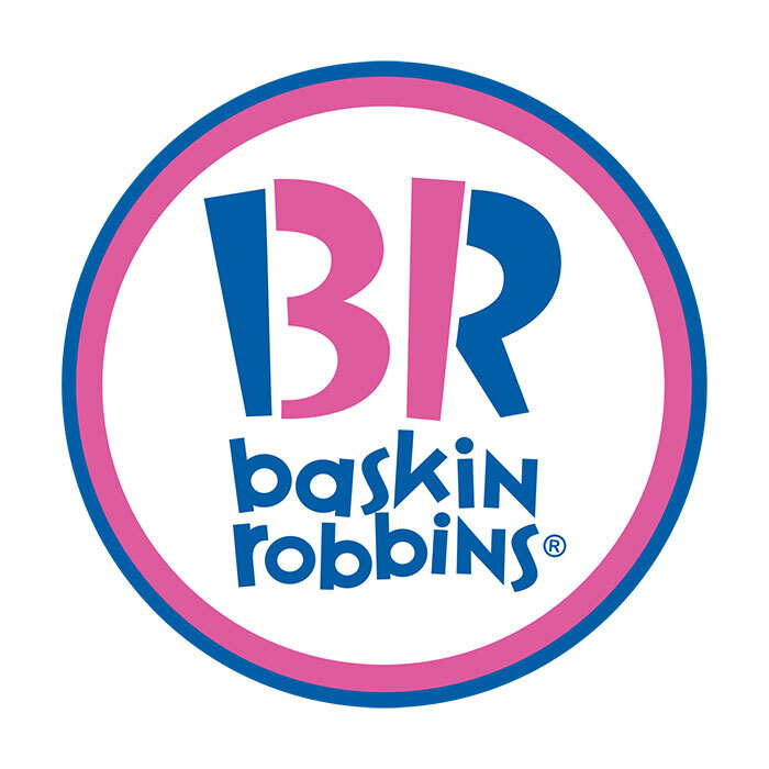
1 - Baskin Robins has 31 flavors - check again the "B" and the "R"
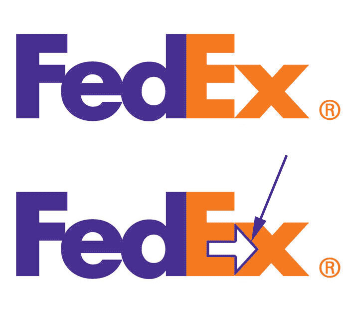
2 - The FedEx logo is mostly known for its tricky optical illusion. If you look closely between letters E and X, you'll spot a white arrow.
3 - The Chicago Bulls logo upside down is...
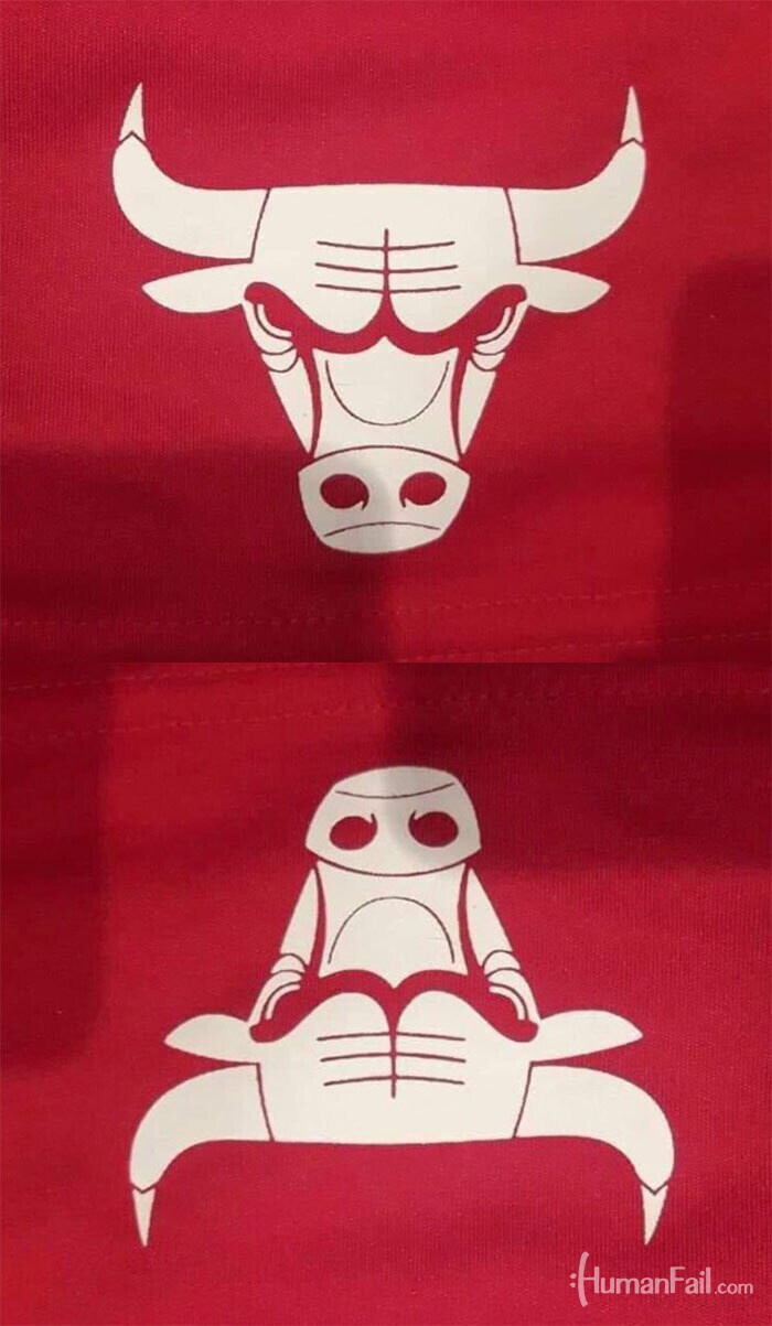
a robot banging a crab.
You never know what could be hidden in front of your eyes when you look at a logo.


